The Emerald was founded in 1900, and in the last century, journalism has grown up and changed distinctly–it looks way different now than it did a century ago.
The Emerald’s masthead–the letters at the top of the page saying ‘Oregon Emerald’ and later ‘Oregon Daily Emerald’ and then just ‘E’–looks way different now than it did then, too.
Here are eight different iterations of the Emerald’s signature on every paper:
1. This 1916 masthead.
Papers were more of a sheet back then–the columns were thin and there were as many as six to a page. Now, more than one story on a page is uncommon.
2. This ornate 1920s lettering.
The Emerald became a daily in the early ’20s as the school was growing.
3. This wacky, book-illustration-ish ’50s masthead.
4. This blocky, un-ornate ’60s masthead:
5. This aesthetically pleasing ’70s header:
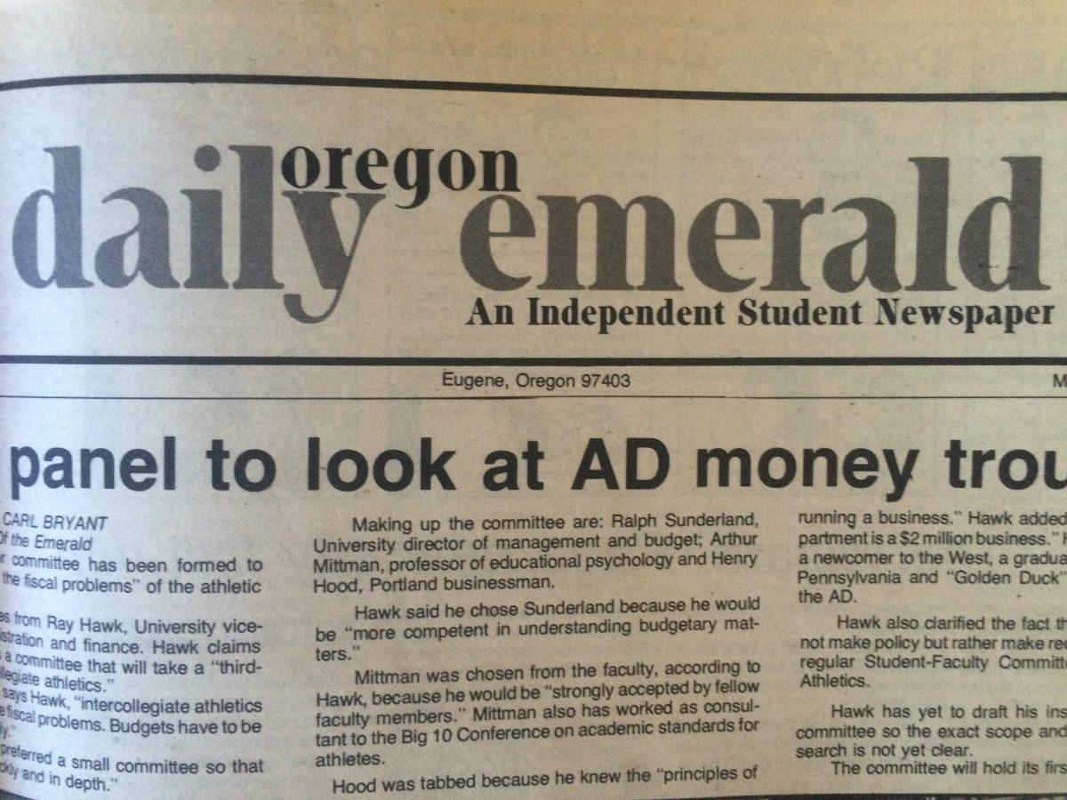
6. This utilitarian ’90s masthead.
’90s design wasn’t about style, for the most part–many newspapers even dropped text with serifs.
7. This bevelled, embossed title line.
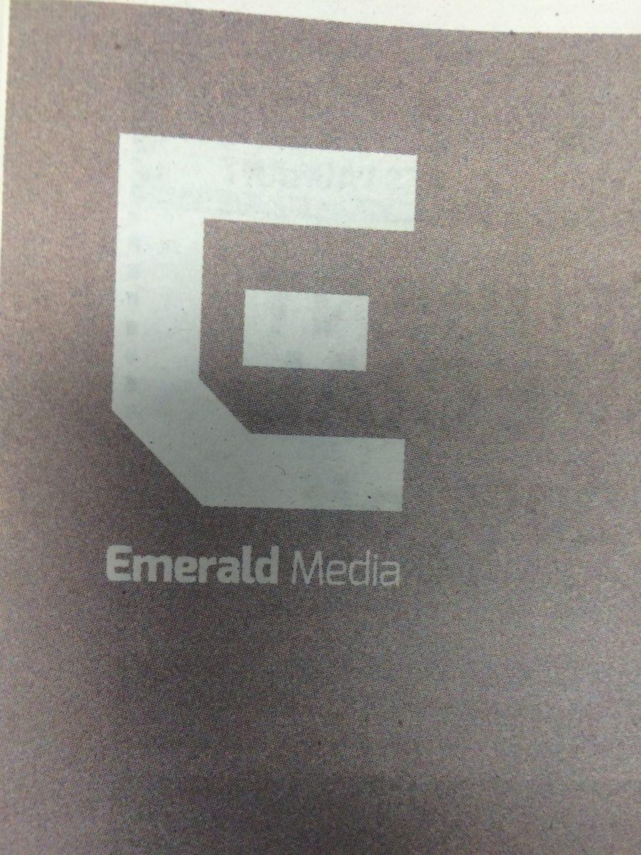
8. This modern, stripped down single letter.
In 2012, the Emerald went through what we called the ‘Revolution,’ where our daily newspaper turned into a twice-a-week tabloid-style news magazine. The paper started focusing efforts into digital media first, and publishing more and more stories that don’t show up in the newspaper–like the one you’re reading now.
#TBT: How the Emerald masthead has changed
Scott Greenstone
May 27, 2015
#TBT: How the Emerald masthead has changed
0
More to Discover


