Since June, the Daily Emerald has been undergoing some massive changes in our design and newsroom. We launched a new website, which involved an export of over 57,000 stories and nearly the same amount in photos and multimedia content.
Our previously sole News desk, a giant of up to 13 reporters at times, was split into two news teams with the goal of diversifying our coverage. Today, our Campus News reporters and City News reporters cover stories with a similar, yet different, mission: to pursue the truth. A mission we’ll pursue whether it be in student government halls or local government halls and whether on the streets of Eugene or on campus at the University of Oregon.
We even redesigned our social media graphics while we were at it, too.
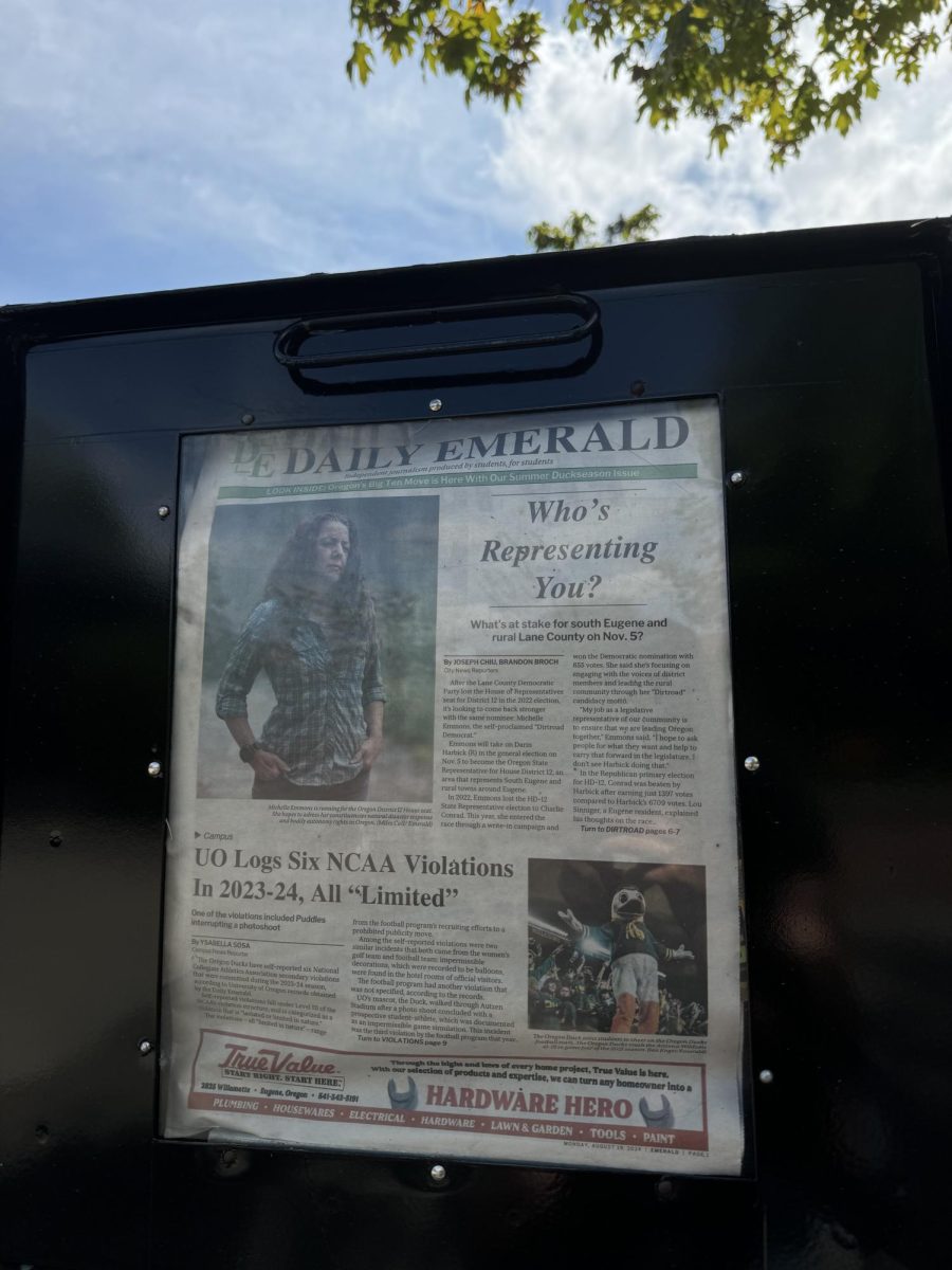
And, if you’re really judging a book (newspaper) by its cover (frontpage), we completely redesigned our newspaper from front to back. We took a look at our masthead, logo, font choices, choices in color, and, most importantly, how we were showcasing our stories to you and what stories we should showcase. We decided to rip it up and start again.
There’s a lot to unpack here. But first, we’ll start with the why behind the Emerald’s newsroom-wide redesign.
The last time the Emerald’s print edition went under the knife and donned a new look was nearly 12 years ago. Current Emerald staff members and alumni alike know this period as the “Revolution” – fronted by the Emerald Media Group publisher at the time, Ryan Frank, the “Revolution” aimed to modernize the Emerald’s structure.
It did. And it’s a heavy inspiration to us right now. But after 12 years of the same print design, we wanted a break from the past and once again embrace the traditional newspaper format. Something different – both with our visual showcase and with what content we were running. The decision? More stories, fewer word count, hyper-local news and hyper-timely topics.
Each change has been made with the intention of highlighting the diverse work of our staff. From indicating writers’ positions on staff in the bylines to creating more breathing room for our photographers’ captions, we celebrate each creative team of ours in an enduring print medium.
We are proud and privileged to be able to continue delivering our stories in print. Our return to a more traditional newspaper look speaks to the core of our goal with this revamp: platforming hard-hitting, independent student journalism.
We’re extremely excited to be finally sharing this months-long project with you. We hope, since we had you in mind during this whole design process, that you’ll enjoy reading through it.
See you again in September,
Tristin Hoffman, Editor-in-Chief; Ryan Ehrhart, Design Editor; Mathias Lehman-Winters, Managing Print Editor


