

There’s a specific narrative that accompanies each Oregon athletic squad.
The Ducks, without fail, take the court or field wearing the finest uniforms Nike has to offer. Whether that be the classic white and green, the new-era black and yellow or a wacky combination of all four, Oregon always finds a way to look cooler than its competitors.
No. 11 Oregon baseball started its season 3-1 on Opening Weekend, and three of those games featured different jerseys. Many teams cannot boast that ability to change wardrobe so easily, and that’s not all this team has to offer.
Here’s my comprehensive ranking of each of the uniforms the Ducks will wear this season:
- Gray Jerseys
Worn last year, but not yet so far this season, Oregon’s gray jerseys take the bottom spot on this list. These feature a charcoal gray jersey and pants with yellow accents and black lettering. These are last for one major reason: Oregon never needed a fifth color. Everything in the Ducks’ uniform arsenal works well enough that it shouldn’t warrant the use of a completely unrelated hue. Gray jerseys feature in many of Oregon’s sports, but never sit quite right with me.
- Green Jerseys
Simple and classic, but doesn’t display the flashiness and pizzazz of an average Oregon fit. The greens are the primary home uniforms of the Ducks and generally include the use of white pants. However, these are the second-best home uniforms — we will talk about the others later. “Legacy Green” is the primary colorway for most of Oregon’s athletic teams, but again doesn’t display any modicum of flashiness. It feels wrong to knock something for being too generic even though it works, but throats get cut when jerseys are ranked.
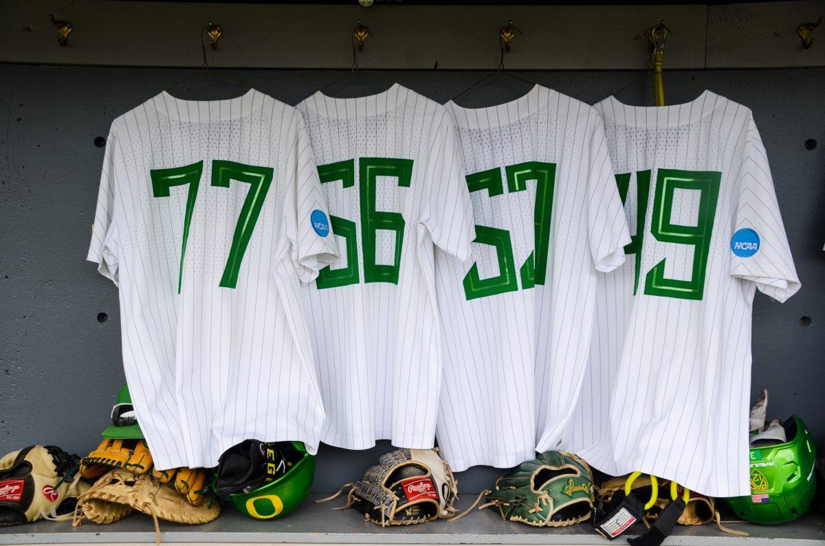
- White Pinstripes
To say that these aren’t the best white jerseys speaks volumes to what will come next in this list. The jersey and pants match, white with green pinstripes throughout. Pinstripes, in my opinion, are the cleanest look that a baseball team can put out. Every team that does it, does it in their own unique way, and the Ducks are no exception. The green pinstripes aren’t matched by many others, and stand out in a way that Oregon is meant to.
- Black Jerseys
It’s not an Oregon team without a neat black and yellow colorway. Baseball might be the squad that does it best. The black base provides the perfect background for the in-your-face yellow used by Oregon athletics. The yellow Oregon displayed across the chest along with the accents and bright yellow “O” on the black hat. Everything about this uniform screams flashiness and everything that Oregon’s most avid haters loathe: style.
- White Throwbacks
Probably the simplest of the five recurring colors for the Ducks, the throwbacks are everything that works about each of the others. The soft green accents accompanied by the cream-colored base for the jerseys make for the perfect callback to baseball’s glory days. Oregon, in a rare move from the Ducks, look straight out of the 1950s, but in the best way. The thin green writing across the jersey works both as a creative way to display the brand and a throwback to some of the first uniforms used in the sport. While it is nothing that tends to characterize Oregon’s sports teams, these throwbacks make for a different, but refreshing look for the Ducks. In an era where many of Oregon’s teams wear the same, flashy uniforms, making a throwback work should be much more difficult than these Ducks make it.


